The Idea For My T.V. Ident Has Come From Brain Storming Sessions Using Mind Maps And Word Association With Things That Link To What The Channel Stands For. The Channel I'm Designing An Ident For Is BDC1. BDC1 Represents The Best Of The Brit School And On My Brief It Said That I Needed To Communicate Aspects Of What The School Stands For E.G. Performance, Excitement, Fun, Creativity, Innovation, Design, Youth, Energy, The Future And Talent. I Created A Mind Map From These Words And Used Word Association To Branch Out The Ideas Of Each Word. From These I Picked Fun & Youth As I Felt There Was Most I Could Do With What I Came Up With during My Brain Storm.
I Then Did Another Mind Map With Just These 2 Words And Developed My Final Idea Of My Ident Form There.
My Final Idea For My T.V. Ident Is A Child's Toy Train Going Round A Track That Is Being Build At The Beginning .
The Train Has A 3D 1 On the Top Of The Train,
As It Goes Round The Track The Camera Pans Out To Give A Eagle Eye View Of The Track To Reveal that It Is Shaped In The Letters BDC.
This Then Morphs In To The Actual Logo Of BDC The One Then Fades In Later On.
I Will Create The Effect Of The Toy Train Track Being Built By Using Still Images Sped Up To Look Like It's Actually Being Filmed (Stop Motion) This Will Be Carried On As The Train Starts Going Round The Track. The Still Images Will Be Edited And Sped Up In Final Cut Pro.The BDC Track Shape That Will Be Featured In The Last Image Of The Sequence Will Then Morph In To The Actual Logo Of BDC I will Do This By Adding Effects Over The Top Of The Final Cut Pro Projects Using Adobe After Effects Where I Can Add In Extra Effects Such As Chimney Smoke To Look Like Steam Trains And Movement To Make The Logo Appear And Disappear In The Right Places At The Right Time. This Is The Tutorial I Will Use For The Smoke On The Final Ident And Have Practised Using Before:
After My Final Ident Looking Back On My Final Ident Both The 10 And 20 Second Ones The Main Thing That I Would Change Would Be Having Someone Help Me Build The Train Track As It Would've Kept The Images More Aligned. I Would Also Use A Wider Space With A Different Coloured Background So That The Track Would Stand Out More. However I do Like My Final Product And I Think It Fits In With The Theme Of The T.V. Channel And The Ideas That It Represents. Although I Did Change My Ident Slightly From My Original However I Feel That It Looks Better This Way Than I Would If I'd Have Done It The Way I Previously Planned. The Way I Originally Planned It Would've Also Been More Difficult To Take The Necessary Pictures Needed For The Stop Motion Aspect Of The Ident.
On Screen Graphics Can Be Used In Various Different Ways Such As:
Title Sequences At The Start Of T.V. Shows
For Sport Scores/ Statistics During Live Events
For Title Menus On DVDs
For Info-graphics On The News Like During Elections To Show Which Party Has The Majority Seats
Benefits Of On Screen Graphics
On Screen
Graphics Are A Great Way To Illustrate And get A Point Across To The Audience
On Subjects That May Have Otherwise Been Hard To Explain And Understand. These Pictures Are Examples Of A Few On Screen Graphics Currently Used On T.V.
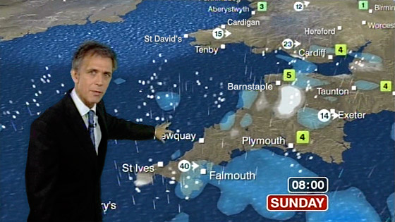
The First Of These Is The Weather, Originally The Weather Was Presented To Us With A Map And Stick On Weather Symbols Due To The Development Of On Screen Graphics And How Quick It Is To Make Them Now They Are Used Multiple Times A Day For Our Weather Forecast.
The Second Of These Is A Swing Statistic Used On American T.V. During Baseball Games It Comes Up On The Screen With A Short Player Profile Giving The Viewer All Of The Necessary Information They Need On The Payers Or Rules, This Is Especially Helpful For People That Have Never Seen A Certain Player, Team Or Even Sport Before.
The Third Of These Are Info Graphics Used On BBC News During Election To Represent Which Political Party Has Won In Each Constituency Around The UK, This Allows Us To Take In The Information Better Than If They Just Read It Off Of A List.
The First On Screen Graphics Were Used In The 1950's And Were Invented At M.I.T. (Massachusetts Institute Of Technology). However Graphics As We Know Them Were First Used In The 1980's When They Became More Necessary Due To The Fact That More T.V. Channels Were Being Added And So The Graphics Were Needed To Identify Which Channel The Viewer Was Watching. Historically On Screen Graphics Were Not As Crucial To The T.V. Viewing Experience As They Are These Days This Is Because Of The Limited Amount Of Channels Available To The Audience Meaning That There Was Less Competition Between The Channels. The More High Tech The Graphics Were The More Persuaded The Audience Would Be To stick With The Channel As It's Would Be More Interesting And Intriguing, This Would Then Gain The Channel More Money Through It's Viewing Figures Which They Could Then Re-Invest Into Better Quality Shows Or More Graphics.
In The 1980's-90's A 10 Second Animated Sequence Would've Needed 250 Images at 25 Frames Per Second All Cells Would've Been Drawn By An Artist Which Would've Taken At Least 40 Hours For 10 Seconds. In 1992 For The General Election It Took 2 Years To Make The Info-Graphics Needed For The Night Of The Election, They Were Created On Quantal Paintbox.
Limitations Of On Screen Graphics:
Through Out The Use Of On
Screen Graphics There Have Been Limitations
In The 80’s They Were:
-Time Consuming
-Bad Quality
-Space Consuming
-Expensive
Although On Screen Graphics
May Look More Impressive These Days There Are Still Very Expensive In Terms Of Machinery
And Software Opportunities Of On Screen Graphics: On Screen Graphics Have Created Opportunities For T.V. Channels To Boost Their Ratings By Using The Best Graphics For The Channels Idents It Attracts More Attention From The Audience While They're Flicking Through The Channels. As More People Are Watching The Channel They Earn More Money That They Can Re-Invest In To More Graphics And More Shows. RGB And Problems With Red
RGB Stands For Red Green Blue These Are The Colours In An Additive Colour Model. Mixing These Colours Together Creates A Broad Palette Of Colours That Can Be Used For On Screen Graphics. However Due To Modern Day Technology Evolving So Quickly In Regards To Television Sets Colours May Not Be Translated Properly Between Different Screens e.g. Pink May End Up Looking Red or faded. Problems With Typography Typography Is The Appearance And Layout Of Text. This Can Be A Problem When It Comes To T.V. And On Screen Graphics As Everybody Has A Different Sized T.V. Screen And So If A Font Is Perfectly Placed And A Decent Size Of The Designers Screen When Blown Up Or Shrunk To Fit On Someone Else's It Could Become Distorted Or Pixelated Or Even Just Too Small To See. Problems With Screen Resolution As With The Varying Technology That Causes Issues With Colour And Type The Resolution Of Screens Also Changes Depending On Your T.V. Screen The Higher The Resolution The Better Quality The Image Will Be And So If People Have A Worse Quality T.V. Screen The Graphics Will Look Less Impressive. This Also Works The Other Way Round If You Have A Higher Quality T.V. Screen The Graphics May Show More Imperfections.
Problems With Aspect Ratio Aspect Ratio Is The Size Of An Image On The Screen Is Because Of The Difference In T.V. Sets The Size Of The Screen Also Differs. If A Movie Has Been Made In a Wide Screen Ratio Such As 16:9 Older T.V. Screens May Cut Off The Edges Of An Image And Vice Versa Older T.V. Programs Made To Fit A Smaller Screen May Appear With A Black Boarder Round The Outside Of The Image. Some T.V.s Have Settings To Fix This However This Can Then Distort The Image And Effect Its Quality. In Conclusion In Conclusion On Screen Graphics Have Developed Greatly Over The Years Becoming Part Of Everyday Life Today. Although There Are Limitations To Them Involving Technology Of The Consumer Moving To Fast For Producers And Artists To Keep Up With. However The Opportunities Out Way The Limitations And The Advantages Of On Screen Graphics To Enhance The Viewers Experience While Watching T.V. The Few Limitations Which Will Effect Only A Small Amount Of The Audience Are A Small Price To Pay.
Companies Know Who To Aim Their Shows At By Categorising The Audience, They Do This By Splitting Up The Mass Audience Into Groups By Using:
Age
Gender
Status
And Different Types Of Demographics Such As:
Socio-Economic Status (Older Fashioned Can Lead To Stereo Types)
Psychographics (More Modern And Intelligent)
A Few Companies That Produce These Surveys Are:
VALs (Values Attitudes Lifestyles) Who Target Programs At Groups By Giving Various People A Psychographics Survey.
BARB (Broadcast Audience Research Board) Who Recruit A Panel Of Homes And Fit All Their T.V. Sets With A Box That Monitors Which Channels They Watch.
4Cs (Cross Cultural Consumer Characterisation) One Of The Companies They Are Part Of Is Young Rubicon, They Also Believe That There Are 7 Types Of People In The World, They Also Use The Maslow Hierarchy Of Needs.
Getting Started On An Analysis It's Easier To Analyse Something When You Know Where To Start A Few Things We Looked At To Begin With Were: Setting/ Place What Time Period It's Set In Tempo (Fast/Slow) Audience Interaction Is It Informative Or Entertaining Density (How Busy Is It?) Disney Channel Movie Ident 2012
This Ident Is Set In A Fictional Place Much Like A Fairy Tale Which Ties In With The Idea Of Disney The Music That They Have Used Also Uses This Fairy Tale, Magical, Typical Disney Idea. The Fact That It's Set In a Fictitious Place Means There Is No Set Time Period However We Can Tell It's Quite Modern Because Of The Movie Characters That Have Been Used In It. Both The Music And The Tempo Of The Ident Are Fast Tempo This Makes Us Excited For Whats Coming Up Next As Well As The Fact That This Ident Was Designed For A Children's T.V. Channel And So Doesn't Allow Time For Children To Get Distracted Due To Their Short Attention Span. The Ident Does Have Some Audience Participation As The Camera Angle Used Makes It Look And Feel Like You're Going On A Journey Through The Pictures And Sets Used In The Ident There Is Also A Certain Amount Of Nostalgia Used By Reminding You Of Your Favourite Characters From Your Childhood Which Keeps Your Attention. The Ident Is Very Entertaining As It Takes You Through A Journey With Your Favourite Characters However It Is Also Informative as It Shows You The Variety Of Different Movie Genres And Characters They Have In Their Movies Showing That The Channel Has Something For Everyone, Also Using The Logo At The Beginning And End Informs You Of What Channel You're Watching If You've Just Put It On. It Is A Very Busy Ident With Lots Going On As Your Being Bombarded By Pictures Of Characters At All Times This Is Also Brought Out By The Fast Flowing Tempo Of The Ident. The Ident Fits Its Audience Because Of Its Use Of Happy Looking Characters Making The Younger Audience Feel Happy And Welcome As Well As The Shot Timing Not Allowing Their Attention To Go Astray And The Bright And Wide Variety Of Colours To Keep The Mood Light. The Disney Channels Mission Statement Says "We Seek To Develop The Most Creative, Innovative And Profitable Entertainment Experiences And Related Products In The World." Which They Have Shown Though The Creative And Entertainment Aspect Of This Ident. Their Goal Is "stream entertainment television for children with original series and movies." Examples Of Which they Have Used In The Ident. Sky News Ident 2012
The Setting Of This Ident Could Be Considered Very Futuristic And Metallic It Maybe Though Of As Being Like Cyber Space Due To The Dark Colours And Bright Electronic Lights This Could Also Be Thought Of Because Of The Subjects Used In The Ident e.g. Phones, Laptops,Tablets. The Tempo Of The Ident Is Fast This Matches The Music Used In The Background And Could Represent The Fact That The News Is Getting Out To The Public Quickly No Matter Where They Are Which Is Also Shown By The Pictures. The Ident Is Basically Asking For The Audience To Interact With It By Using The Pictures Of Real Life Objects Like The iPhone etc To Say That You Can Get The News Where Ever You Are And Also By Using Screen Shots Of The News On The Screens Of These Devices. The Advert Is Completely Informative As Its For A Information T.V. Channel Using The Pictures Of Electronic Devices To Inform You How You Can Get The News While On The Go, As Well As This The Logo Is Both Shown At The Beginning And End Of The Ident To Inform You Of Which Channel You're Watching f You've Just Tuned In. The Audience Is A More Mature One And This Is Shown Through The Restricted Use Of Dark And Bold Colours As Well As The Serious Sounding Music. The Ident Is Not As Busy As The Previous Ident That We Analysed As It Just Has One Main Focus At A Time Rather Than Being Bombarded By Many Different Images At One Time. According To Sky, Sky News Is Valued For "Fairness, Balance And Journalistic Objectivity" As Well As Being Credited For Its "Speed Of Its 24-Hour Coverage And Flexibility In Reporting Live News" Which Fits Well With The Design Of The Ident And Can Be Identified With Due To The Images Used. Sky Movies Premiere
The Purpose Of This Ident Is To Lets The Audience Know That There Is A Variety Of Different Genres of Movies They Do This By Panning Through A Wide Variety Of Different Settings In Which The Images Shown Have Been Slightly Merged Together Representing Different Genres (e.g. Space- Sifi Desert-Westerns) They Have Done This In Order To Show The Audience That They Aim At Which Is A Wide Mainly Family Based Audience As There Is Something For Everyone In The Family. The Ident Is Very Entertaining However It Does Inform You Of The Variety Of Movies On The Channel As Well As Which Channel You're Watching The Quick Changes In The Scene Also Entertain The Audience And Keep Them Interested And Catch The Eye Of People That May Just Be Flicking Through The Channels. The Music Used Matches each Genre As It Changes And The Camera Pans As If In A 360 angle Finishing Where It Began. Sky Says That The Sky Movies Channel Is The "Complete Service Showing A Huge Choice Of Movies From The Latest Hollywood Blockbusters To Cult Classics" Re-Packaging Of CBBC Old CBBC
The Ident Is Simple And To The Point With The Arrow At The End Pointing Towards The Entrance Of The Channel, This Would've Been Used At The Channel Start At The Begging Of The Day. It Is Brightly Coloured Which Fits The Target Audience Of Younger Children, It's Quick And So Doesn't Allow The Younger Audiences Attention To Go Astray. There Is No Music Used Just "Whooshing" Sounds As The Logo Is Travelling Around The Screen. The Fact That The Logo Is Always Present On Screen Is Good As It Means That As Soon As You See The Ident You Know Which Channel You're Watching Immediately. The Ident Is Not That Busy As There Is Just One Main Focus All The Way Through However It Is Fast Moving Which Fits The Hyper-Active Characteristics Of Its Young Audience. It's Set In A Fictional Animated World That Is Brightly Coloured The Fact This Is A Fictional Setting Matches The Unique Imagination Of The Younger Audience Its Aimed At The Animated Aspect Of It Gives Off A futuristic Atmosphere. The Ident Is Mainly Entertaining Rather Than Informative Because Of The Whooshing Effect And Blobby Noises That Could Be Considered Amusing To The Children, However It Is Informative As It Is Informing The Viewer Of Which Channel They Are Watching.
New CBBC
The Ident Uses Audience Participation As The Audience Are Attracted By The Use Of The Channels Characters In The Ident As Well As The Final Words "CBBC" Which Everybody Seems To Sing Along. The Ident Is Entertaining As It Shows The Characters Playing With The Letters As Well As Being Informative And Telling You What Type Of Shows Are On The Channel And Which Channel You're Watching And Being A Confirmation For The Children The Channel Is Aimed At That It Is Their Channel By The Use Of The Recognisable Characters And Music. The Ident Is Busy And Fast Moving With Lots Of Different Things Going On In The Foreground And The Background. The Images Used In The Ident Are A Mix Of Real Life And Animation Which Fits With The Idea Of Children's Wild Imaginations The Ident Is Also Quite Short Which Keeps The Attention Of The Younger Audience Even With A Shorter Attention Span. Comparison: During The Re-Packaging Of The CBBC Suite Of Idents They Have Redesigned The Logo And Along With This The Colour Scheme Of The Channel Going From The Variety Of Bright Colours With The Blob Effect Logo To The New Green White Colour Scheme With A More Jagged 2D Cartoon Logo. They Have Also Added The Singalong Type Music That Is So Well Known To The Channels Audience These Days Adding More Audience Participation As Well As Adding Cameo Appearances Of The Channels Characters In The Background. The Re-Packaged Ident Is Faster Moving And Busier Than The Previous. I Feel That The Re-Package Has Worked Better Than The Previous Ident Due To Is Identifiable New Music And It's Quicker Pace Matching Up To Their Audiences Characteristics As Well As The BBC's Mission Statement "To enrich people's lives with programmes and services that inform, educate and entertain." As Well As There Vision Of Being A "creative organisation" Re-Packaging Of UKTV Gold to G.O.L.D UKTV Gold
The Setting Of The Ident Is In A Real Life Setting Of An Apartment Which The Viewer Can Relate To The Apartment Lights Up And The Subject Stops Doing What They're Doing As UKTV Gold Is Turned On The T.V. The Time That The Ident Is Set In Is A Current Day Setting Around Evening Time This Also Relates To The Viewer As This Is The Usual Time That People Get To Sit Down And Watch The Telly.
The Ident Has A Slow But Steady Pace All The Way Through However It Slows Even More When Gold Comes On The T.V.
The Only Audience Participation Used In The Ident Is The Way That The Audience Can Relate To The Circumstance That The Subject In The Ident Is In.
The Ident Is Entertaining In The Way That The Man Is Just Hanging From The Bar At The End However It Is More Informative Telling The Viewer About Which Channel They Are Watching.
The Ident Is Not Really That Busy There Is Just One Main Focus And Few Colours Have Been Used To Make It Look Life Like And Like A Real UK Flat.
New G.O.L.D.
This Re-Packaged Ident Is Fast Moving And Very Busy As Multiple Cartoon Images With Nothing Really To Do With The Channel Sprawl Out Over The Entire Picture With Their Slogan Of 'Stick Something Funny On'. The Music Matches The Quirky Feel Of The Ident With The Simple Backing Tracks And Male Vocables.
There Is No Real Setting To The Ident Just A Plain White Background This Means We Cant Quite Tell Which Time Period It's Set In However From The Amount Of Cogs And Springs Linking The Images Together We Could Assume It's Based In A Machine.
The Images Move Quickly Around The Screen Some Popping Out Of Nowhere In The Background And Some Coming Out Of The All Ready Flowing Images. The Music On The Other Hand Is Slower And More Calm Than The Visual Side Of The Ident.
There Isn't Really Any Audience Interaction Within The Ident Apart From People Trying To Spot The Different Images Appearing From Out Of Nowhere.
The Ident Is MOre Entertaining Rather Than Informative This Is Probably Intentional Due To The Channel Being Based Completely Around Comedy Shows And Sitcoms. The Only Information The Ident Gives You Is The Name Of The Channel That The Viewer Is Watching And The Slogan Of The Channel.
Comparison:
The Re-Packaging Of The Channel I Feel Has Improved The Overall Appearance Of The Channel As Well As Fitting In Better With What The Channel Now Stands For And It's New Mission. Previously To The Re-Packaging The Channel Showed A Variation Of Shows However Now It Has Been Split In To Different Channels With GOLD (Go On Laugh Daily) Being Reserved For Comedy Only With It's Mission To "Make People Laugh". This Fits In With It's New Branding As It's Now Funnier And More Entertaining For The Audience Just Like The Shows Now Shown On It.
What Is The Purpose Of A T.V. Ident? To Identify The T.V. Channel And Branding To The Audience. A T.V. Ident Is Created To Show The Identity Of A T.V. Channel As Well As The Branding Of The Channel. This Helps Create Brand Loyalty Towards The T.V. Channel As Long As The Ident Stays Similar Each Time That They Re-Pagage There Ident Suite Such As BBC One Always Keeping Their Circle Design In Their Logos. This Keeps Their Viewers Loyal To Them As They Are Loyal To Their Identity And Branding. Why Do We Need T.V. Idents? T.V. Idents Needed To Differentiate Between The Different Channels As Well As Give You And Idea Of What Content The Channel Shows. An Example Would Be That Children's T.V. Channels Often Use Cartoon Characters, Contain Large Amounts Of Animation And Are Usually Brightly Coloured (CBBC/ Disney Channel/ POP Girl etc.) However With Channels Aimed At A Older Audience Are More Realistic In Colours, Content And Setting. Idents Are Especially Necessary In The Modern Day World Of T.V. Channels As There Is So Much Competition Over The Audience Due To Excessive Numbers Of T.V. Channels. It Is Important For T.V. Channels To Have A Impressive Ident As It Will Help Attract An Audience, The T.V. Channels With Larger Audiences Get Given More Money Than Other Channels Which They Can Then Re-Invest In To Even Better Idents And Content For The Channel. Channel 4 Channel 4 Are Consecutively Fourth In The Viewing Figures According To BARB Scoring 12,769,000 On Average Per Day, This Is Behind Both BBC1&2 As Well As All ITV1 Channels Combined.
How Do Companies Create Idents? T.V. Channels Create Their Idents And Shows Based On The Audience They Think Will Be Watching They Do This Based On Age, Gender And Class And Then Give It A Code These Are Called The Socio-Economic Demographics e.g. Channel 4 Aim Themselves At ABC1 16-44s (ABC Stands For The Class, 1 Stands For The Housing Area, 16-44 Is The Age Group). More Modern Media Companies Use Psychographics Which Uses Surveys To Find Out Attitudes, Values, Lifestyles, And Opinions Instead Of Basing It On How Much Money You Make.
social grade
social status
occupation
A
upper middle class
higher managerial, administrative or professional
B
middle class
intermediate managerial, administrative or professional
C1
lower middle class
supervisory or clerical, junior managerial, administrative or professional
C2
skilled working class
skilled manual workers
D
working class
semi and unskilled manual workers
E
those at lowest level of subsistence
state pensioners or widows (no other earner), casual or lowest grade workers
A T.V. Ident Is An Animated Logo That Shows The Branding Of A T.V. Channel. e.g. The BBC1 Hippos Or The BBC2 Tent.
T.V. Idents Are Used To Make The Channels Stand Out Against Each Other As There Are More Of Them Nowadays And So By Creating More Exciting Idents Is A Way Of The Channels Winning A Bigger Audience.
 I Created A Mind Map From These Words And Used Word Association To Branch Out The Ideas Of Each Word. From These I Picked Fun & Youth As I Felt There Was Most I Could Do With What I Came Up With during My Brain Storm.